 I recently discovered ImageSpike after reading about it on the Free Technology for Teachers blog, and I can see endless possibilities with this tool! This would be a wonderful way to make my images more interactive. According to the website, ImageSpike allows users to "mark up" photos with "interactive hotspots." This sounds confusing at first, but it's easy to understand the concept once you see a "spiked" image. It's also very easy to create one. To spike an image, first upload a picture from your PC or supply the URL address. Next, click on areas of the picture to create "hot spots." Hot spots are dots that appear on your image. When you hover over the dot, a link appears. You can link these hot spots to videos, web pages, images, etc. Again, just supply the URL for the content you want to link to the hot spot. It's multimedia on steroids. Below is my first ever "spiked" image--a photo of Bernini's The Rape of Proserpina. This shows how I would use ImageSpike in my own classroom: to link resources to an image, keeping my information organized and visually stimulating. I could also see having students create images loaded with their own hot spots; this could take place of a standard poster board presentation, or could be used as part of a student presentation. I could also have students visit a "spiked" image (similar to the image below) and then take notes or answer questions related to the media that students are directed to. This would also work great with maps; I already have plans to create a spiked image of the journey of Odysseus to use this upcoming school year. How will you use ImageSpike? 
0 Comments
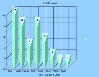
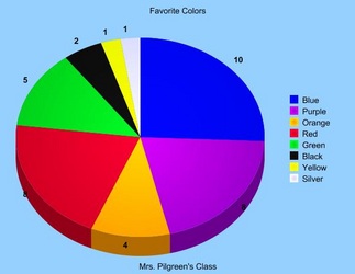
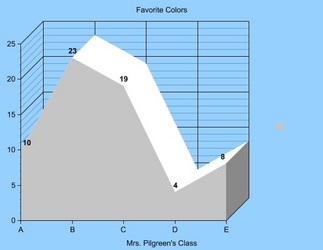
 I found a blog post about Games for Change on the Education Ad Infinitum website created by Stephanie Krajicek. This website offers a wide range of online games covering topics such as civics, economics, and the environment. Right away, the game "What Race Am I" caught my attention; I'm currently building a curriculum for a class centered on culture and I thought that this game would be a great conversation-starter for my low-level seniors. I downloaded it onto my iphone and played several times. Another game that caught my attention, but I haven't downloaded is "Real Lives 2010," a real-life simulator that randomly selects the country in which the player is born and provides tons of information about that person's environment and culture. Unfortunately, this is one of the few games that is not free. Still, there are a lot of games offered with legitimate educational outcomes. These aren't games to kill time, nor are they games "just for fun." These games are engaging and thought-provoking, everything an educational game should be. 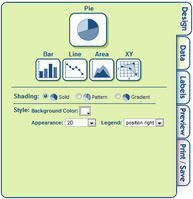 Create a Graph allows users to easily create attractive graphs and charts. As an English teacher, this would be helpful for creating visual aids for persuasive speeches. This would also be useful for science teachers, given the amount of graph and chart analysis on standardized tests. (The science portion of the ACT is almost entirely composed of charts.) There are plenty of customizable options to play with, and the final product can be saved, printed, or e-mailed. Create a Graph offers an extensive of file format options for download (pdf, svg, png, jpg, emf or eps). Below I'm embedding a few sample graphs that were created in a manner of minutes. I chose the light blue background and 3D options as a matter of personal preference; they can be altered to fit your needs. 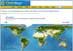 ClustrMaps is a fun and informative widget that you can embed on your website, or the websites of your students. Simply visit the ClustrMaps websites, enter the URL of the site you want to create a map for, and an HTML code will be generated for you. ClustrMaps appears as a world map with red dots, varying in size based on the amount of visitors from a particular region. Of course, since discovering ClustrMaps my blog has had an all-time low number of visitors (an extremely modest 14) but what's really interesting is that I had no idea people were visiting my website from their homes in Ireland, Australia and Singapore. The idea of someone across the globe stumbling into my humble little blog is so neat! As a student, I would be so excited to see how many people were viewing my writing portfolio, and where those readers might be located. With that said, (shameless begging) please forward the URL for my blog to as many foreign countries as possible! I want more dots! UPDATE (7-8-11): I was noticing some major inconsistencies between my clustr map and the statistics that I was receiving from Weebly (my website host). For instance, as of today, my clustr map reports 130 visitors to my website; however, according to Weebly, I had 248 visitors yesterday alone. With the question "what's up with that?" spinning in my head, I discovered that Clustrmap only counts visits to the page where the map itself is displayed, so if anyone visits another blog or post (anything other than the page where I embedded the clustr map) it won't be counted. Weebly, on the other hand, counts visits to any blog or post on my website. This makes sense, really. Not sure how to "fix" this solution so that Clustrmaps counts all of my page views without embedding the map on every since page, though. I'll play around with it and, in the meantime, you may see some clustrmaps randomly appearing. :) UPDATE 12-16-11 A HUGE thank you to the ClustrMaps team for explaining why Weebly's tallies are inconsistent with ClustrMap's stats. And another thank you to ClustrMaps for providing such accurate information without counting duplicate visitors or IP addresses. Comparing ClustrMaps' visitor count to Weebly's visitor count will provide me with a whole new layer of data! (Please the comment posted below by the ClustrMaps team.) The "Did You Know" series of videos seem to be a staple in every technology-enthusiast's supply. The videos are great attention-grabbers and conversation-starters when it comes to illustrating the growing impact that technology has on students in particular, and society in general. The version embedded here is Did You Know 4.0, which contains the most up-to-date statistics, but if you search You Tube for the previous versions, you will find them likewise inspirational. Happy watching! 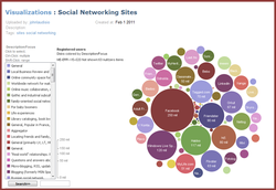 ManyEyes brings va-va-voom to data visualization. Create your own visualization, or browse charts, graphs and tables that have already been created. This is your new blog post. Click here and start typing, or drag in elements from the top bar.
|
AuthorDr. Jessica Pilgreen, Ed.D. Archives
December 2020
Categories
All
|
